About Dr Frost Learning
Dr Frost Learning is a leading educational maths platform used by secondary schools in the UK and worldwide. Trusted by thousands of schools and millions of students, it offers interactive online resources, real exam questions, smart marking tools, and personalised learning for Key Stages 3, 4, and beyond. Founded by award-winning teacher Dr Jamie Frost, it’s recognised as one of the most impactful digital tools in maths education.
What they needed
With an ever-growing user base and a strong reputation in the education sector, Dr Frost wanted to build a brand that reflected their deep commitment to supporting teachers who often feel overwhelmed and under-resourced. Their vision is to provide unmatched precision, flexibility, and depth in maths teaching tools, while creating an experience that feels clear, trustworthy, and forward-looking.
They approached Fruto to help reimagine their brand identity in a way that could:
Highlight their unique offering of advanced, high-quality teaching tools
Inspire confidence and clarity among time-pressed teachers
Appeal equally to educators and students
Create a foundation for a future expansion beyond maths
We were brought in to run a brand strategy process and create a refreshed visual identity that could carry this vision forward.
What we did for them
Brand strategy workshop
We began with a collaborative brand strategy workshop involving senior stakeholders. This uncovered the organisation’s core purpose, vision, values, audience segments, and personality. Together, we mapped how the brand could better communicate its mission and connect meaningfully with both educators and learners.
From this, we helped define the following brand foundations:
Brand core (Purpose statement, vision and core values)
Brand positioning
Brand persona (Brand personality and tone of voice)
You can read more about how we run these workshops in our blog post: Brand strategy to improve customer experience.
Visual identity and branding guidelines
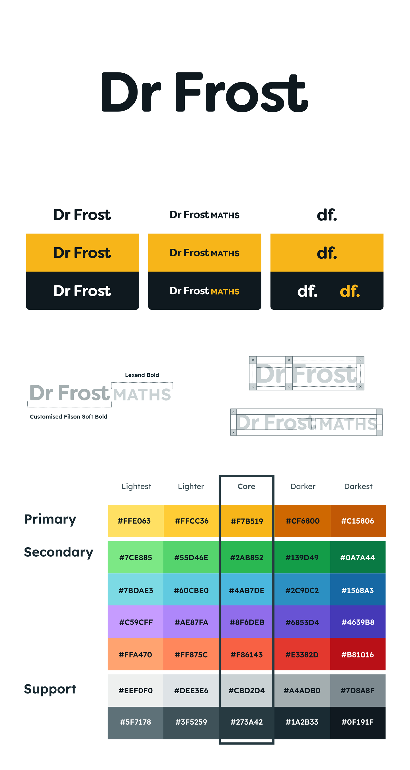
Following the strategy phase, we created an inspiration board and explored multiple logo directions. The final visual identity was centred around simplicity, distinctiveness, and long-term flexibility, avoiding maths-specific motifs to enable future subject expansion.
We delivered a complete brand package that included:
Logo: A bespoke typographic wordmark, with subtle, meaningful customisations for a distinctive, professional look.
Colour palette: Accessible colours designed for clarity, legibility, and brand recognition.
Typography: Chosen for optimal legibility and reading performance, eliminating cognitive noise and supporting both young learners and busy teachers.
Icon set style: Simple, friendly icons with rounded edges, easy to recognise and quick to interpret, even at small sizes.
All of this was brought together in a comprehensive brand guidelines document, alongside a brand strategy deck to guide future content, UX, and communication design decisions.
Results
The new brand identity gives Dr Frost Learning a professional and distinctive presence, one that reflects the platform’s educational mission while offering room to grow. The brand now strikes the right tone for both teachers and students, striking a balance between authority and accessibility. With a clear purpose, strategy, and visual identity now in place, Dr Frost Learning is better positioned to scale its impact across the education sector.
→ See how we partnered with Dr Frost to enhance their platform’s UX through ongoing design support.