Impact
Fruto enabled CABI to successfully launch a scalable, user-focused digital toolkit for a global agricultural audience.
We delivered a mobile-first, multilingual UI design to support international growth and accessibility.
We implemented intuitive filtering and search features to improve user engagement and resource discoverability.
We future-proofed the toolkit to enable efficient multi-language rollouts and simplify internal management.
We optimised the interface for low-bandwidth environments to expand reach in developing markets.
We enhanced stakeholder satisfaction, as shown by strong adoption and positive feedback from global users and CABI leadership.
"The Fruto team played a pivotal role in translating the theoretical foundations of the wheat blast prototype into a practical and tangible design. They quickly assimilated complex information, enabling a highly collaborative and iterative development process that resulted in a clear, responsive, and user-focused prototype."
About CABI
The Centre for Agriculture and Bioscience International - better known as CABI - is a non-profit organisation that improves people's lives worldwide by providing information and applying expertise to solve problems in agriculture and the environment.
CABI provides a number of additional services to its member countries, including access to flagship knowledge products including the world-renowned CAB Abstracts and Global Health databases, and the CABI Academy.
What they needed
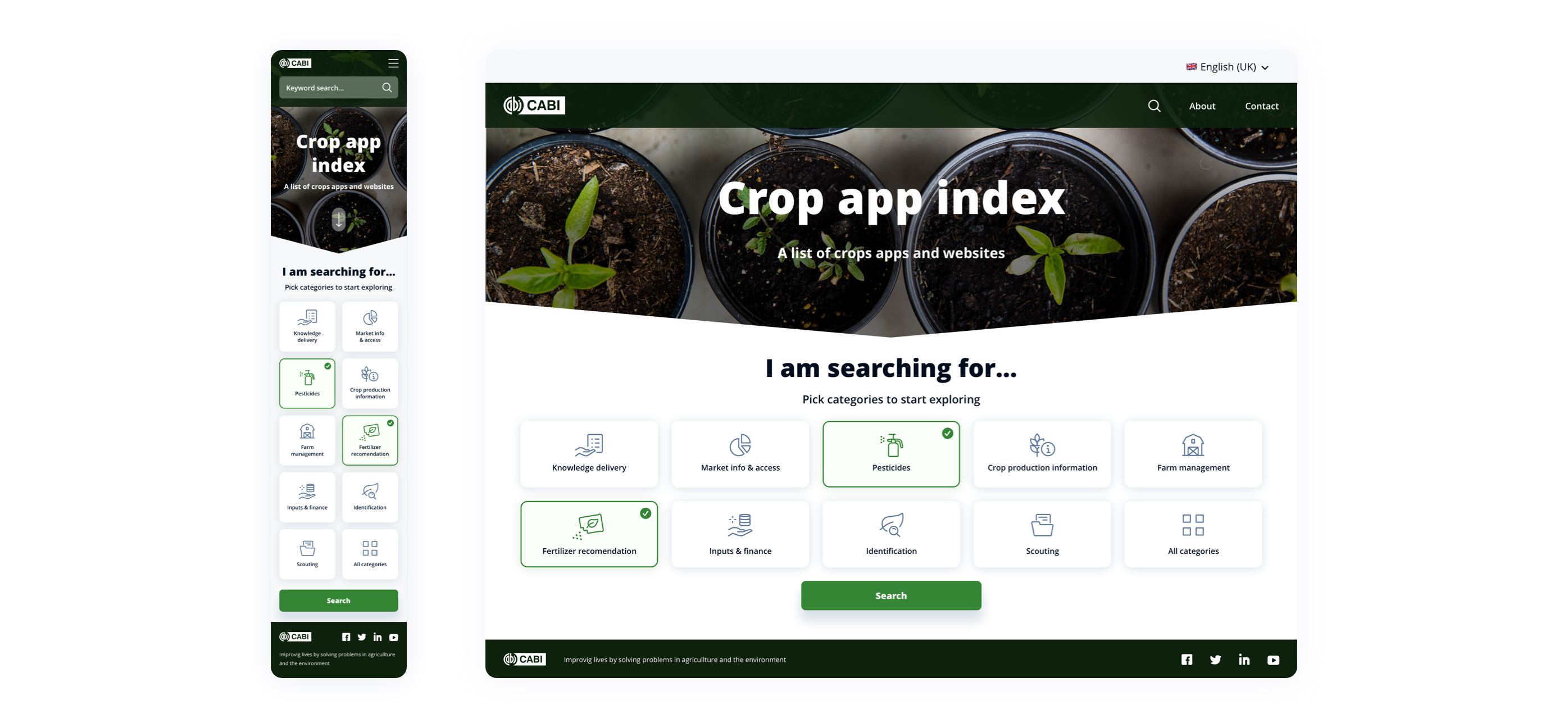
CABI approached Fruto to design the user interface (UI) for a new digital toolkit that would act as an agriculture app-discovery resource for agricultural service providers, farmers and others in the plant health system.
App research and categorisation had already taken place, and CABI had identified a need for list-, filter- and search functionality, and the ability to link to Apple’s App Store, Google’s Play Store, or the relevant website for each recommended tool.
With a global audience to cater for - including those in developing countries - the design needed to be mobile-friendly and account for the limited internet access faced by users in some locations.
What we did for them
Combining CABI’s own research with our knowledge of best practice, design principles and usability conventions, we were able to design a solution that was not only intuitive and cost-effective, but also sustainable and easy to maintain in the long run.
Early wireframing of the key filtering system that the rest of the design would rely on meant we could focus on getting the usability aspects - content, layout and flow - right before moving on to applying branding and refining the styles only once the most practical solution had been identified.
As multi-language support was on the longer-term roadmap, we also took this into consideration during the wireframing stage. This meant that when CABI were ready to roll-out additional languages, the design wouldn’t break as the varying word/character lengths used by different languages is already accounted for.
Intuitive filters and search
To make the user experience as smooth as possible for such a wide range of users, a simple yet intuitive filtering system formed the basis of the design - enabling users to select and view only results that were relevant to them based on their role, location, and/or device capabilities.
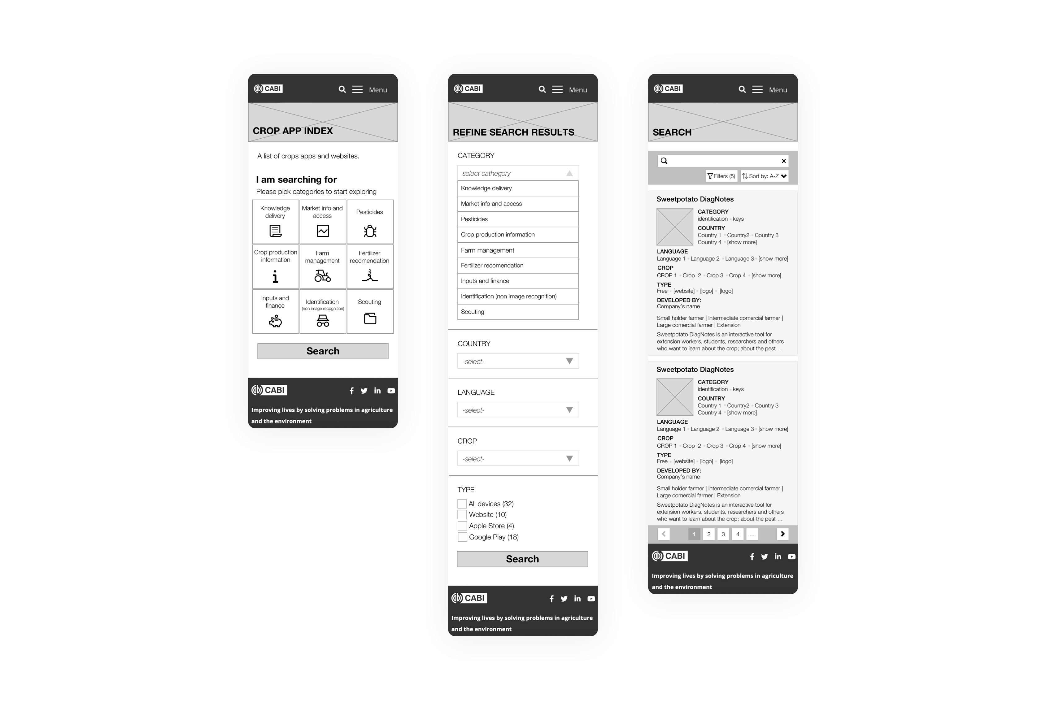
Wireframes
Mobile-first, responsive UI designs
Knowing that most users would access the site on a mobile device meant we needed to take a mobile-first approach. This ensured that critical page elements - for example, buttons, menus, etc, as well as the page content itself - would deliver a frictionless experience regardless of the device used to access the site.
As we also knew that users in some regions wouldn’t have access to fast internet speeds or the latest mobile phones, the designs also needed to account for potentially slow page loading times and lower resolution displays, in addition to supporting multiple languages.
By limiting the number of images and interactive elements on each page, we were able to design a responsive interface that was accessible to users wherever and however they accessed the toolkit, without impacting overall aesthetics and usability.

Results
CABI launched the Crop App Index in early 2022.
Supporting both the needs of a global user base, as well as being simple to administrate by CABI’s internal team, it has received positive feedback from external and internal users alike.
Fruto really helped us move forward in our project. They helped us turn our requirements in to an attractive and user friendly design. Fruto were really flexible and responsive to feedback, and a pleasure to work with.